October 26, 2021, 7:55 am
Aspose.Tasks for JavaAdds new “Fit to X pages wide by Y tall” properties.
Features
- Added printing support.
- Added support for scaling with a given scale factor.
- PageSettings.PagesInWidth and PageSettings.PagesInHeight are now taken into account when a View is rendered. These properties correspond to the “Fit to X pages wide by Y tall” fields in the Microsoft Project Page Setup dialog.
↧
October 29, 2021, 9:00 am
New Color Picker and QRCode Blazor components.Adds ColorGradient, ColorPicker, FlatColorPicker and QRCode components, plus new Heatmap Chart Series.
Features
- Common
- New ColorGradient Component.
- New ColorPicker Component.
- New FlatColorPicker Component.
- New QRCode component.
- New Heatmap Chart Series.
- Material Theme - v.4.42.0.
- Bootstrap Theme - v.4.42.0.
- Default Theme - v.4.42.0.
- Compatibility with Microsoft .NET 6.0 RC 2.
- DateInput
- Support for placeholders.
- DatePicker
- Add AriaLabelledBy and AriaDescribedBy parameters.
- Support for placeholders.
- DateRangePicker
- Support for placeholders.
- DateTimePicker
- Add AriaLabelledBy and AriaDescribedBy parameters.
- Support for placeholders.
- Editor
- Exposing a Colors parameter and palette into the Editor color tool.
- Gantt
- Еxpose GanttTaskCommandEventArgs.
- Grid
- AutoFitColumn, AutoFitColumns and AutoFitAllColumns methods for autosizing columns.
- Trigger OnEdit, OnUpdate, OnCancel on every cell in Incell EditMode.
- Improve performance of column menu chooser.
- RangeSlider
- Add AriaLabelledBy and AriaDescribedBy parameters.
- Add OnChange event.
- Slider value should be updated on drag.
- Slider
- Add AriaLabelledBy and AriaDescribedBy parameters.
- Add OnChange event.
- Slider value should be updated on drag.
- TextBox
- MaxLength parameter for TextBox component.
- TimePicker
- Add AriaLabelledBy and AriaDescribedBy parameters.
- Support for placeholders.
- TreeList
- AutoFitColumn, AutoFitColumns and AutoFitAllColumns methods for autosizing columns.
- Trigger OnEdit, OnUpdate, OnCancel on every cell in Incell EditMode.
↧
↧
November 1, 2021, 9:59 am
Renew your lapsed subscription today!Bring your lapsed DBI subscription back to current at the regular renewal price!
Solutions Schedule for .NET provides Windows developers with an advanced set of features for creating enterprise Asset Management and Multi-resource scheduling applications. From 1-Nov-2021 to 31-Dec-2021 you can renew your lapsed subscription at the regular renewal rate. In fact, this offer is available for ALL eligible DBI subscription products. This includes:
This limited time offer enables you to bring your expired subscription back into "good standing", so that you will continue to receive support, updates and upgrades. Click the appropriate product name above to view the upgrade price for your product.
↧
November 2, 2021, 8:50 am
New Toolbar Customization APIAdds the ability to customize the DataGrid/TreeList Toolbar on-the-fly.
Features
Microsoft Visual Studio 2022 Support
- DevExpress installers now ship separate VSIX extensions for Visual Studio 2022 to ensure that all major design-time tools (like the "DevExpress" menu, DevExpress Template Gallery, Toolbox, etc.) are fully functional.
Data Grid and Tree List
- API Enhancements:
- New Toolbar Customization API
- You can now customize the DataGrid/TreeList Toolbar on-the-fly:
- You can alter Toolbar items dynamically, at any time (in the past, you could only do so once when the Toolbar was created).
- When using the DataGrid/TreeList within a React, Angular or Vue app, you can customize the toolbar declaratively without direct DOM manipulation.
- Added a new toolbar property that allows you to customize toolbar items in much the same way as a standalone Toolbar. Each DataGrid/TreeList Toolbar item can be specified as an object with the same structure as a standalone Toolbar. You can also specify an item using a predefined string name from the list of built-in DataGrid/TreeList commands (such as 'addRowButton', 'applyFilterButton','columnChooserButton', 'exportButton', 'groupPanel', 'revertButton', 'saveButton', 'searchPanel').
- Disable Command Buttons
- You can now disable certain command buttons for specific rows using the new disabled column button's property.
- Custom Command Button Enhancements
- You can now use the onClick, cssClass, hint, and disabled button properties if you have specified a custom command button template.
- Extended navigateToRow API
- The navigateToRow method now returns a Promise object. You can now be notified when a background operation has finished.
- Virtual Scrolling Enhancements
- Reworked the DataGrid/TreeList's Virtual Scrolling engine and introduced the following enhancements:
- Optimized the row rendering algorithm to increase overall FPS.
- Optimized the data loading algorithm to reduce the number of remote data requests.
- Added a new scrolling.renderAsync property so you can render rows synchronously or asynchronously.
- Improved Search
- Reduced false-positive matches when users search for numbers within the DataGrid's Search Panel. The DataGrid now matches search string with both original and formatted cell values, respecting column formatting.
Data Grid
- Add New Row at a Specified Position
- You can now specify where to insert a new row when using insertBeforeKey or insertAfterKey properties. Both properties accept a key for the row before/after which to insert the new row. For popular use cases, a newRowPosition property with a set of shortcut values has been added:
- "first"/"last" - Insert a new row at the beginning/end of the dataset.
- "pageTop"/"pageBottom" - Insert a new row at the top/bottom of the current page.
- "viewportTop"/"viewportBottom" - Insert a new row at the top/bottom of the viewport.
HTML/Markdown Editor
- Table Management
- This update includes the following table-related features:
- Support for the 'thead' HTML tag (table headers).
- Support for table and column resize operations via the new tableResizing configuration option.
- Context menu for table-related operations. To enable the menu, activate the tableContextMenu setting.
- Multiple paragraph support (<p> tag) within a table cell.
- Table Context Menu customization.
- Manage table/cell properties via built-in dialogs.
- Soft Line Breaks
- The HTML/Markdown Editor includes a new allowSoftLineBreak configuration option. When enabled, users can break text within a single block element into multiple lines (via the <br> tag using the new Shift+Enter keyboard shortcut). This feature allows you to break a list item (<li>) into multiple lines or add multiline cells.
Diagram
- Touch Support Enhancement
- Improved touch screen support in Chromium-based browsers (Google Chrome, Microsoft Edge, Opera).
Gantt
- Visible Date Range
- You can now specify the visible data range using the startDateRange and endDateRange properties.
- Sorting
- You can now sort tasks by one or more columns. Use the new sorting option to configure corresponding UI elements and their behavior.
- Export to PDF
- You can now export Gantt data to PDF. Export options allow you to:
- Set document size and page orientation.
- Limit data export to a specific date range.
- Specify whether to export only chart area, tree list area, or the entire Gantt component.
- Filtering
- The Gantt control now supports filtering. End-users can filter tasks using the header filter or filter row. To filter tasks in code, use the following API:
- New API to Expand/Collapse Tasks
- Task-related (expand/collapse) API enhancements include:
- expandAll - Expands all tasks.
- collapseAll - Collapses all tasks.
- expandAllToLevel - Expands all tasks up to the specified level (the root task has depth zero).
- expandToTask - Expands all tasks to make the specified task visible.
- collapseTask - Collapses the specified task.
- expandTask - Expands the specified task.
- API Enhancements
- Gantt control API enhancements include:
- showDependencies - Specifies whether dependencies are visible in the chart area.
- showResources and showDependencies - Shows/hides corresponding UI elements.
- scaleTypeRange - Allows you to limit zoom range.
- refresh - Reloads data and redraws the entire component.
File Manager
- New API
- The File Manager ships with the following new API:
- Create a directory (directoryCreating and directoryCreated).
- Upload a file (fileUploading and fileUploaded).
- Copy a file or directory (itemCopying and itemCopied).
- Delete a file or directory (itemDeleting and itemDeleted).
- Download a file (itemDownloading).
- Move a file or directory (itemMoving and itemMoved).
- Rename a file or directory (itemRenaming and itemRenamed).
UI Components
- Overlay and Popup Enhancements
- New onShowing and onHiding events allow you to manage the display of a popup.
- The new wrapperAttr property allows you to add custom HTML attributes to the popup root element.
- Popup can now automatically adjust its position when its content changes.
- The new hideOnParentScroll property allows you to close the popup when a user scrolls its container.
- The new dragAndResizeArea property specifies boundaries for drag and resize operations.
- The new dragOutsideBoundary property specifies whether the Popup can overlap container (and window) boundaries during drag operations.
- The new restorePosition property specifies whether the Popup restores its initial position or whether the Popup maintains its position after drag/resize operations.
- CheckBox, TagBox, List Enhancements
- CheckBox enhancements include the following:
- Blur method: Removes focus from the component.
- iconSize setting: Specifies desired icon size.
- You can now assign a 'null' value to the CheckBox value property (to set an indeterminate state).
- CheckBox text is now automatically centered by its icon.
- The new selectAllText property allows you to specify custom text displayed within the "Select All" switch in the List and TagBox components.
- Floating Labels
- Text input/placeholders now support the use of floating labels (conforms to Google's Material Design guidelines) so you can eliminate field labels from all your forms.
- Miscellaneous Enhancements
- PivotGrid - Export Merged Cells to Microsoft Excel - The new mergeColumnFieldValues and mergeRowFieldValues properties allow you to disable/enable cell merge while exporting.
- TreeView - The DevExtreme TreeView widget ships with native scrolling support. Set the useNativeScrolling property to 'true' to enable this feature.
- ScrollView - RTL Support - ScrollView fully supports RTL rendering mode.
- Button Group - New Selection Mode - The ButtonGroup ships with a new selection mode - 'none'. In this mode, group buttons are not selected on click.
Material Theme Enhancements
- Applied changes to the product libraries to mirror some of Google’s most recent Material Design Guidelines. For instance, Google deprecated the ‘underlined’ styling mode for inputs and elected to use ‘filled’ mode by default. Both modes have been preserved and you can switch back to the previous display style when necessary.
Architectural Enhancements
- TypeScript
- Reduced the number of 'any' type entries in the API.
- Properties, events, and methods are now typed based on data.
- Tree Shaking
- Optimized internal module dependencies. This reduces bundle size/code chunk size for specific usage scenarios (e.g. when using Code Splitting).
Native React Grid
- Keyboard Navigation
- End-users can now navigate through grid cells/rows with the keyboard.
↧
November 2, 2021, 8:51 am
Heat Map ControlAdds new Heatmap control which uses color variations to visualize data trends.
Features
Microsoft Visual Studio 2022 Support
- DevExpress installers now ship separate VSIX extensions for Visual Studio 2022 to ensure that all major design-time tools (like the "DevExpress" menu, DevExpress Template Gallery, Toolbox, etc.) are fully functional.
Microsoft .NET 6 Support
- Added support for the latest Preview build of .NET 6. In addition, the DevExpress Template Gallery includes templates for .NET 5 and .NET 6.
New Heat Map Control (CTP)
- The new Heatmap control uses color variations to visualize data trends (tabular format). Features include:
- Data Binding.
- Unbound Mode.
- Multiple Coloring Algorithms.
- Zoom and Scroll.
- Cell Highlighting.
- Tooltip Support.
- Titles.
- Cell Labels.
New Microsoft Windows 10 Dark Theme
- The new Win10Dark theme was inspired by the dark mode on Windows 10. Much like the Win10Light theme, the Win10Dark theme automatically updates its colors after each change to an accent color in Windows. Applications developed with DevExpress WPF UI controls can now automatically switch between dark and light themes based on OS setting.
Windows 11 Support
- Your DevExpress WPF Themed Windows can now include rounded corners to match the look and feel of Windows 11.
- Enable the new ThemedWindow.RoundCorners setting to apply rounded corners to DevExpress Themed Windows and dialogs.
.NET 5 & .NET 6
- New XAML Designer Extensions for .NET 5 & .NET 6
- Added the following extensions to the WPF XAML Designer for .NET 5 and .NET 6 apps:
- Chart Designer - The Chart Designer is implemented as a separate window and allows you to create new and customize existing charts with ease.
- Mask Editor - The Mask Editor allows you to quickly create and customize masks of any complexity.
- New Quick Actions - The new Create Ribbon action allows you to generate a Ribbon UI for the WPF Spreadsheet, Rich Text Editor, and Scheduler controls.
- Added new quick actions to the Data Grid so you can generate grid columns and invoke the grid's Conditional Formatting Editor.
- Improved startup performance for dialogs and wizards invoked via quick actions.
- ARM64 Support
- You can now execute DevExpress-powered WPF apps on ARM64 devices.
- .NET 6 Support
- DevExpress WPF UI controls support the latest Preview build of .NET 6.
- DevExpress Template Gallery - .NET 5 & .NET 6 Support
- The DevExpress Template Gallery includes WPF project templates designed for .NET 5 & .NET 6.
- .NET Core Migration Tool
- Developed a tool that helps you to easily migrate your Microsoft .NET Framework projects to .NET 5 and .NET 6.
Remote Desktop Performance
- The theme cache engine, enabled by default for all built-in and custom WPF themes, now supports multiple sign in/sign out operations. This new option enhances the performance of all WPF apps developed with DevExpress UI components. Performance gains are especially significant for applications executed remotely (using tools such as Microsoft Remote Desktop Services or Citrix), where sign in/sign out operations are more common.
Charting
- Customizable Empty Points
- The DevExpress Chart Control can now process gaps (within a data source) as empty points (points with undefined values). The appearance of these gaps can now be customized with different style options (based on Series view type). You can fully customize the appearance of point markers, line, and area segments for empty points.
- You can also draw 'mock' points instead of gaps (based on values for neighboring Series points). Set the series view’s EmptyPointOptions.ProcessPoints property to 'Interpolate'.
Data Grid and TreeList
- MVVM Command API
- The WPF Data Grid and TreeList controls include the following new commands:
- AddingNewNodeCommand.
- CustomNodeFilterCommand.
- CustomUnboundColumnDataCommand.
- CellMergeCommand.
- CellValueChangedCommand.
- CellValueChangingCommand.
- InitNewRowCommand.
- InitNewNodeCommand.
- InvalidRowExceptionCommand.
- NodeChangedCommand.
- ValidateCellCommand.
- These command properties act as counterparts to standard events and allow you to shape data and respond to user input at the ViewModel level without writing code in the View.
- Lock TreeList Updates
- You can now fully lock calculations and tree hierarchy updates within the WPF TreeList.
- This new API will help improve performance for large data sets (when/if large record sets must be updated simultaneously).
- New CRUD API
- Edit Data - The Server Mode and Instant Feedback sources do not offer inline editing support. This release adds a new behavior (DialogEditFormBehavior) to allow editing within the Edit Form. The following new events have been added: RowEditStarting, RowEditStarted, RowEditFinished and corresponding commands.
- Add Rows - You can now add new records to the Infinite Async Source using the New Item Row.
- Validate Rows on Delete - The grid's new ValidateRowDeletion event and ValidateRowDeletionCommand event allows you to check database constraints before deleting a row from the grid when it is bound to a local or infinite source.
- Refresh Data - You can now use the RefreshDataSource command or press F5 to refresh the grid bound to the Infinite, Paged, Server Mode, or Instant Feedback source. You can execute the refresh operation in a separate task if you don't want to block the UI.
- A RefreshDataSource event and RefreshDataSourceCommand have been added to manually refresh data.
- These APIs are fully compatible with MVVM. An example has been created that binds the WPF Data Grid to various sources (local, Infinite, Paged, InstantFeedback, Server Mode) and executes CRUD operations.
Map Control
- Lambert Azimuthal Equal-Area Projection
- This release includes support for a new projection type – the European Terrestrial Reference System 1989 - Lambert azimuthal equal-area (ETRS89-LAEA) projection. You can use this projection to display European Union (EU) maps with minimal distortion.
- To enable this new projection, set the GeoMapCoordinateSystem.Projection property to Etrs89LambertAzimuthalEqualAreaProjection.
- Create Lines, Polylines and Polygons from a View Model (MVVM)
- Extended ListSourceDataAdapter to generate lines, polylines, and polygons from a collection of coordinates in a View Model.
- Added two new mapping types (MapLineMappingInfo and MapMultipointItemMappingInfo) for lines and multi-point shapes (MapPolylines and MapPolygons).
Rich Text Editor
- PDF Export - Accessible PDF Support
- The WPF Rich Text Editor can now generate tagged (accessible) PDF documents to address needs of those who use screen readers and other assistive technologies. The following standards are now supported:
- PDF/A-1a.
- PDF/A-2a.
- PDF/A-3a.
- PDF/UA.
- Custom Font Loading Engine
- The Rich Text Editor can now use fonts that are not installed on a target system. This feature avoids font substitution effects when you display, print, or export (to PDF) documents with non-standard fonts. You will be able to load necessary fonts from files, streams, or byte arrays. These fonts will be available to all instances of the DevExpress Rich Text Editor within a given project.
- Field Enhancements
- The DevExpress Word Processing Document API and Rich Text Editor now support SECTIONPAGES, REF, and STYLEREF fields. The following field-related enhancements are also included:
- You can now replace fields with field values.
- New UpdateAllFields method: Allows you to update all document fields (including fields located in headers, footers, text boxes, footnotes, and endnotes).
- You can now suppress DOCVARIABLE field updates for loaded documents.
- Watermark Enhancements
- Extended the Watermark API for the DevExpress Word Processing Document API and Rich Text Editor. You can now execute the following actions:
- Insert watermarks into individual section headers.
- Modify existing watermarks (change watermark options and replace watermark image or text).
- Remove watermarks from individual sections.
Spreadsheet
- PDF Export - Accessible PDF Support
- The WPF Spreadsheet control can now generate tagged (accessible) PDF documents to address needs of those who use screen readers and other assistive technologies. The following standards are now supported:
- PDF/A-1a.
- PDF/A-2a.
- PDF/A-3a.
- PDF/UA.
- Custom Font Loading Engine
- The Spreadsheet controls can now use fonts that are not installed on a target system. This feature avoids font substitution effects when you display, print, or export (to PDF) documents with non-standard fonts. You will be able to load necessary fonts from files, streams, or byte arrays. These fonts will be available to all instances of the DevExpress Spreadsheet within a given project.
- Set Print Settings in Print Preview
- The 'Print Preview' window includes a new Settings pane. This pane allows you to specify the following print-related settings:
- Select spreadsheet content to print. You can print the entire workbook or print a portion of the document.
- Specify the number of copies to print.
- Customize page settings (document orientation, paper size, and page margins).
- Set print scaling.
- New CellEditorOpened Event
- A new CellEditorOpened event has been created. This event allows you to:
- Access the active in-cell editor.
- Handle the editor's keyboard events to execute custom actions or implement custom shortcuts.
- Spell check text in the editor.
- Handle the editor's TextChanged event to track text changes and validate user input.
- Custom Paper Size Support
- With this release, you can specify non-standard paper sizes when printing documents. Use the new 'Worksheet.ActiveView.SetCustomPaperSize' method to define custom paper size for a worksheet.
Accessibility
- Screen Reader Support for Validation Errors
- Screen readers can now inform a user of validation errors within focused WPF editors and data cells.
- Visual Studio & Microsoft Office Themes - Enhanced Contrast Palettes
- The enhanced Contrast palettes use carefully selected color combinations to help individuals with vision impairment (to distinguish text, borders, selection states, and other visual elements). Enhanced Contrast palettes are available for the following themes:
- Office2016SE.
- Visual Studio 2017.
- Office 2019.
- Visual Studio 2019.
Compile-Time ViewModel Generator
- This release includes the following enhancements:
- WinUI Project Support.
- Nullable Annotation Support - The ViewModel Generator now accounts for the nullable context to create null-safe code and avoid compiler warnings.
- Generic and Nested Classes - The ViewModel Generator can now work with generic and nested classes.
- Comments - You can add XML comments to fields/methods, which will then be copied to corresponding properties and commands.
- Optimized Memory Allocation and Performance Improvements.
- ISupportParentViewModel Support.
- You can now use the ViewModel and Blank MVVM Application templates in the Template Gallery to automatically create a project with a configured ViewModel code generator.
Miscellaneous
- SVG Enhancements
- The internal SVG image parser can now display raster images embedded in SVG.
- Splash Screen Enhancements
- Added the showDelay and minDuration parameters to the SplashScreenManager.Show method so you can show a splash screen with a time delay.
↧
↧
November 2, 2021, 8:52 am
Rich Text EditorAdds new Blazor DropDown and Rich Text Editor controls.
Features
Microsoft Visual Studio 2022 Support
- DevExpress installers now ship separate VSIX extensions for Visual Studio 2022 to ensure that all major design-time tools (like the "DevExpress" menu, DevExpress Template Gallery, Toolbox, etc.) are fully functional.
Blazor UI Components
New Blazor DropDown
- The new Blazor DropDown component allows you to display a non-modal drop-down window within a Blazor application. The DropDown includes the following integrated features:
- Header, Body, and Footer Customization.
- Position Customization.
- Position Restrictions.
- Custom Size.
- Resizing.
- Scrolling.
- Show and Close Actions.
New Dashboard
- Added localization support and includes a new API to unregister extensions. Note: DevExpress Dashboard ships as part of the DevExpress Universal Subscription.
New Rich Text Editor
- The Rich Text Editor allows you to incorporate advanced text editing functionality into your Blazor app. You can create, open, edit, convert, save, and print rich-formatted text files (DOCX, RTF, TXT). Features include:
- Ribbon UI.
- Print Layout / Simple View.
- Horizontal Ruler.
- Character & Paragraph Formatting.
- Bullets & Numbering.
- Header & Footer.
- Document Sections.
- Table of Contents.
- Bookmarks & Links.
- Page Numbers.
- Fields.
- Pictures & Text Inputs.
- Dialogs.
- Undo / Redo.
- Localization.
Grid (CTP)
- Data Editing and Input Validation
- The Blazor Grid now allows you to edit associated data within a standard edit form or a popup edit form. To enable data editing:
- Create an edit form template and assign it to the EditFormTemplate property.
- Handle the EditModelSaving event to post changes made in the edit form to a data source.
- Set the EditMode property to 'PopupEditForm' to display the edit form as a popup.
- The Blazor Grid automatically validates user input based on data annotation attributes. You can also apply and use custom data validation rules.
- Filter Row
- Blazor Grid now ships with an integrated Filter Row. The Filter Row displays in-place text editors for all associated data columns. The Grid creates a filter condition based on editor values and applies this condition to the corresponding column. To display the Filter Row, enable the ShowFilterRow option.
- Added the following new options to help you customize the Filter Row as requirements dictate:
- FilterRowOperatorType – Specifies the comparison operator used to create filter conditions (Equals, Contains, StartsWith, Greater, Less, etc.).
- FilterRowValue - Specifies the initial value in a filter row cell.
- FilterRowCellTemplate - Allows you to display a custom editor in a filter row cell.
- FilterRowEditorVisible - Specifies whether to display the filter row editor.
- You can also manage filter options in code. Call the FilterBy method to filter Grid data and the ClearFilter method to reset the applied filter.
- Command Column
- Added a new Command Column (DxGridCommandColumn) which can display CRUD-related commands (New, Edit, Delete) for each row. It can also clear the filter applied within the Grid's Filter Row.
- Row Selection
- Blazor Grid now supports single and multiple row selection. Use the SelectionMode property to specify the desired selection mode. To select/deselect rows with a pointing device, enable the AllowSelectRowByClick option.
- The Blazor Grid also ships with a new column type - DxGridSelectionColumn. This column can display a checkbox (with multi-select support) or radio buttons in single selection mode.
- Added new methods to help manage record selection in code:
- SelectRow / DeselectRow.
- SelectRows / DeselectRows.
- SelectDataItem / DeselectDataItem.
- SelectDataItems / DeselectDataItems.
- SelectAllOnPage / DeselectAllOnPage.
- ClearSelection.
- To access selected data items in code, use the SelectedDataItems property.
- Group Footer Summary
- You can now display group summary values within group footers. To display group summary values, set the summary item’s FooterColumnName property to the name of a group footer column.
- Group Footer Templates
- Added new DxGrid.ColumnGroupFooterTemplate and DxGridColumn.GroupFooterTemplate properties which allow you to customize group footers as needed.
- Group Footer Display Mode
- Added a new GroupFooterDisplayMode property which allows you to specify the manner in which group footers are displayed. Available options include:
- Auto.
- Always.
- Never.
- IfExpanded.
- Vertical and Horizontal Scrolling
- The Blazor Grid now displays a vertical scrollbar when content height exceeds the height of the component itself.
- A horizontal scrollbar automatically appears when total width (of all columns) exceeds the width of the component itself.
- Pager Customization
- The DevExpress Blazor Grid includes the following pager-related customization options:
- PagerVisible - Specifies whether the Grid displays its pager.
- PagerPosition - Specifies pager position (at the bottom, the top, or both at the bottom and the top).
- PagerNavigationMode - Sets the navigation mode available to users (use numeric buttons, use the input box, or automatic).
- PagerSwitchToInputBoxButtonCount - Specifies the number of pages used when the pager automatically switches from numeric buttons to the input box.
- PagerAutoHideNavButtons - Hides the pager's built-in navigation buttons when all numeric buttons are displayed on-screen.
- PagerVisibleNumericButtonCount - Specifies the maximum number of numeric buttons displayed within the pager.
- Page Size Selector
- Users can now modify page size at runtime. To display the Blazor Grid's page size selector, enable the PageSizeSelectorVisible option. Use the PageSizeSelectorItems property to define available page size values.
- To display all records in the underlying data source, enable the PageSizeSelectorAllRowsItemVisible option (the page size selector will include "All" within the page size list).
- Column Width Enhancements
- Improved the algorithm used to manage column width and added a MinWidth property. By default, minimum column width is 50 pixels.
- Column Text Alignment
- The Blazor Grid automatically aligns text within data cells/footer cells based on column type and bound data type. Use the new TextAlignment option to specify text alignment as needs dictate.
- Column Name
- Added a Name property to all Grid columns. Use this property to specify the column’s unique identifier.
- Access Data Item
- You can now access the processed data item within data-related event handlers (CustomSort, CustomGroup, CustomSummary, etc) and the CellDisplayTemplate.
Data Grid
- Extended the capabilities of the original Blazor Data Grid (DxDataGrid) with the following features:
- Optimized JavaScript interop operations for speed and stability.
- A column's Visible, SortIndex, SortOrder, GroupIndex, VisibleIndex properties now support two-way data binding.
- You can now bind the grid to a dynamic object with compound property names.
- HtmlDataCellDecoration event now supports INotifyPropertyChanged data objects.
- You can now create/render grid columns based on a condition.
Charting
- New Pie/Donut Chart Component
- The Blazor Chart has been split into two distinct components:
- DxChart - represents Cartesian charts.
- DxPieChart - represents Pie and Donut charts.
- Added the following new properties for the Pie/Donut Chart:
- Diameter.
- MinDiameter.
- InnerDiameter.
- Localization
- You can now localize months and days (numeric and date formats now correspond to the current thread locale).
- Custom Position of an X-Y Axis
- The following new properties allow you to customize X-Y axis position:
- Alignment.
- CustomPosition.
- CustomPositionAxisName.
- Offset.
- Side-by-Side Stacked & Full-Stacked Bar Charts
- You can now create side-by-side Blazor Bar Charts. Use the new Stack property to specify the desired chart stack.
- Series and Constant Line Appearance
- The new Blazor Charts DashStyle property allows you to specify a dash style for a line series or a constant line. The following settings to control the appearance of constant lines have been added:
- Color.
- DisplayBehindSeries.
- ExtendAxis.
- Break Series on Empty Points
- The Blazor Chart component now includes a new BreakOnEmptyPoints option. Enable this option to display empty points (points with undefined/null values) as breaks.
- Axis Major and Minor Ticks
- This release includes two new Blazor components: DxChartAxisTick and DxChartAxisMinorTick. Use the following options to customize the appearance of major (AxisTick) and minor ticks (AxisMinorTick):
- Visibility (Visible).
- Color.
- Length.
- Shift.
- Width.
- Opacity.
- Zero Value Always Visible
- The Blazor Chart component's value axis now always displays a zero value for Area and Bar series. For other series types (like Line, Point and Range), zero values may be omitted. To display a zero value regardless of series type and value(s), use the ZeroAlwaysVisible property.
- Refresh and Redraw Blazor Charts Manually
- You can now refresh and redraw your Blazor Chart as needs dictate.
- RefreshData - updates the Chart control to reflect changes made to the underlying data source and then redraws the Chart control.
- RedrawAsync - forces the Chart control to redraw itself (immediate redraw).
- Limit the Maximum Number of Auto-Generated Scale Breaks
- You can now use the MaxAutoBreakCount property to limit the maximum number of auto-generated value axis breaks (when the AutoBreaksEnabled property is set to 'true').
Data Editors
- Date Edit - Date Time Offset Type Support
- You can now bind the Blazor Date Edit component to DateTimeOffset and DateTimeOffset? data types.
- ComboBox, ListBox, and TagBox - Item Template
- The Blazor ComboBox, ListBox, and TagBox components now support item templates. Use the 'ItemTemplate' property to define your custom template.
- ComboBox - Validate by Text or Value
- Use the ValidateBy property to validate the editor based on its text or underlying value.
- SpinEdit - Enable/Disable Mouse Wheel
- The Blazor SpinEdit now ships with a new AllowMouseWheel property (prevents users from modifying the editor's value with the mouse wheel).
- Button - Navigate URL
- The Blazor Button component now ships with a new NavigateUrl property (URL used when a button is clicked).
- CheckBox - API Enhancements
- This release includes the following Blazor CheckBox-related API enhancements:
- AllowIndeterminateState - Enables indeterminate checkbox state.
- LabelWrapMode - Specifies CheckBox label wrap mode. Available values: WordWrap, Ellipsis and NoWrap.
Navigation and Layout
- Form Layout - Disabled and Read-Only States
- The Blazor Form Layout component and its associated layout elements (items, groups, and tab pages) now support disabled and read-only states (new Enabled and ReadOnly properties).
- Form Layout - Tab Page Header CSS
- The DxFormLayoutTabPage component now ships with a new HeaderCssClass property (applies a custom CSS class to tab page headers).
- Form Layout Groups - Header Template and API Enhancements
- Groups within the Blazor Form Layout component now support header templates - HeaderTemplate.
- You can also use the HeaderCssClass property to assign a custom CSS class to a group header. To assign a CSS class to the entire group, use the CssClass property.
- Tabs - Scroll Modes
- You can now use the new DxTabs.ScrollMode property to specify navigation options when tabs do not fit within a container (width). The following tab scroll modes are available:
- NavButtons - Users can navigate to non-visible tabs in the following manner: via navigation buttons, or by hovering the mouse pointer over a tab, holding the Shift key, and scrolling the mouse wheel.
- Swipe - User can navigate to non-visible tabs in the following manner: via a wipe gesture or by hovering the mouse pointer over the container, holding the Shift key, and scrolling the mouse wheel.
- Auto - Tab scroll mode adapts to device type. Mobile and tablet devices use Swipe mode. Desktop devices use NavButtons mode.
- NoScroll - Users cannot scroll to non-visible tabs. Tabs that do not fit the container are moved to a new tab row.
- Context Menu - Templates
- You can now customize the content and appearance of Context Menu items. Use the following properties to specify common templates for all items and templates for individual items:
- DxContextMenu.ItemTemplate / DxContextMenuItem.Template - Templates used to display the entire area (for all or individual items).
- DxContextMenu.ItemTextTemplate / DxContextMenuItem.TextTemplate - Text templates (for all or individual items).
- DxContextMenu.SubMenuTemplate / DxContextMenuItem.SubMenuTemplate - Submenu templates (for all or individual items).
- Context Menu, TreeView - Bind to Flat Data
- You can now bind the Context Menu and TreeView components to flat data with the following:
- Context Menu - DxContextMenu.Data and DxContextMenu.DataMappings.
- TreeView - DxTreeView.Data and DxTreeView.DataMappings.
- Menu - Bind to Data
- You can now bind the Menu component to a data source. To bind a menu, use the component's Data and DataMappings properties. In bound mode, data source items are used to auto populate menu items.
- Popup Enhancements
- You can now use the IsInitialized property to track a Popup's initialization state within code.
- The Closing event's arguments now include a new property - CloseReason. This property identifies the action that initiated the close operation: Programmatically, EscapePress, CloseButtonClick, or OutsideClick.
- API Enhancements
- DxToolbarItem.SubmitFormOnClick - Item click can submit a parent form.
- DxTreeView.Target | DxTreeViewNode.Target - Specify the target attribute's value for all or individual nodes. In bound mode, DxTreeViewDataMapping.Target defines a mapping to a data source field with the target attribute's values.
- DxTreeViewNode.IconUrl - Specifies the URL of a node's icon. In bound mode, DxTreeViewDataMapping.IconUrl defines a mapping to a data source field with icon URLs.
Scheduler
- Date Header, Resource Header, and Time Cell Customization
- You can now customize the content and appearance of time cells, date headers, and resource headers.
- Snap to Cells
- All Blazor Scheduler Views now include a SnapToCellsMode property. With this property, you can enable/disable the snapping of appointments to time cells or enable automatic snapping (based on appointment time intervals).
- Responsive Layout - Enhancements
- The Blazor Scheduler component's Day, Week, and Work Week Views now have compact date headers. These Views also adapt date headers and the time ruler to small screens.
- All Scheduler Views can also hide appointment captions (when space limits the component's ability to display the caption in full).
- HTML Cell Decoration
- The new HtmlCellDecoration event allows you to customize the appearance of Scheduler cells.
Blazor Report Viewer
- Search, Document Map and Export Options Panels
- The Blazor Report Viewer has now reached feature parity with the HTML5 Document Viewer. In this release, the following UI elements were added:
- Export Options Panel.
- Search Panel.
- Document Map with Bookmarks.
- Multi-Page View
- The Blazor Report Viewer can now display the entire document. You can scroll pages and zoom the view to see multiple pages at once.
- Content Security Policy (CSP) Support
- You can now use the DevExpress Blazor components on websites with a Content Security Policy (CSP).
ASP.NET Controls
Charting
- Customizable Empty Points
- The DevExpress Chart Control can now process gaps (within a data source) as empty points (points with undefined values). The appearance of these gaps can now be customized with different style options (based on Series view type). You can fully customize the appearance of point markers, line, and area segments for empty points.
- You can also draw 'mock' points instead of gaps (based on values for neighboring Series points). Set the series view's EmptyPointOptions.ProcessPoints property to 'Interpolate'.
Diagram
- Touch Support Enhancement
- Improved touch screen support in Chromium-based browsers (Google Chrome, Microsoft Edge and Opera).
Gantt
- Custom Callbacks
- The new client-side PerformCallback method and server-side CustomCallback event allow you to send and handle custom requests between the server and the client.
- Visible Date Range
- You can now specify a visible data range using the following server-side properties:
- GanttViewSettings.StartDateRange.
- GanttViewSettings.EndDateRange.
- To specify the visible date range on the client side, use the SetStartDateRange and SetEndDateRange methods.
- Display/Hide Dependencies
- Added a new UI element alongside new APIs to display/hide dependencies in the Gantt chart:
- Show Dependencies Toolbar Item.
- ShowDependencies().
- ASPxGantt.GanttViewSettings.ShowDependencies.
- New Gantt API
- This release ships with the following new APIs:
- UnassignAllResourcesFromTask - Unassigns all resources from tasks.
- ShowTaskDetailsDialog - Displays the 'Task Details' dialog.
- ZoomIn and ZoomOut - Zooms in and out.
- ViewTypeRangeMin and ViewTypeRangeMax - Limits zoom range.
- ShowResources - Displays/hides resources.
General Enhancements
- This release includes quality-related enhancements for both the Web Forms/MVC data container controls (GridView, TreeList, and CardView) and the Web Forms/MVC Data Editors Library. Major enhancements include:
- New client-side API for Batch Mode.
- Improved adaptivity and accessibility.
- Enhanced client and server architecture.
ASP.NET Core Controls
Data Grid
- Add New Row at a Specified Position
- You can now specify where to insert a new row when using InsertBeforeKey or InsertAfterKey methods. Both properties accept a key for the row before/after which to insert the new row. For popular use cases, a NewRowPosition method has been added with a set of shortcut values:
- "first"/"last" - Insert a new row at the beginning/end of the dataset.
- "pageTop"/"pageBottom" - Insert a new row at the top/bottom of the current page.
- "viewportTop"/"viewportBottom" - Insert a new row at the top/bottom of the viewport.
Data Grid and Tree List
- API Enhancements:
- New Toolbar Customization API
- You can now customize the DataGrid/TreeList Toolbar on-the-fly:
- You can alter Toolbar items dynamically, at any time (in the past, you could only do so once when the Toolbar was created).
- When using the DataGrid/TreeList within a React, Angular or Vue app, you can customize the toolbar declaratively without direct DOM manipulation.
- Added a new Toolbar method that allows you to customize toolbar items in much the same way as a standalone Toolbar. Each DataGrid/TreeList Toolbar item can be specified as an object with the same structure as a standalone Toolbar. You can also specify an item using a predefined string name from the list of built-in DataGrid/TreeList commands (such as 'addRowButton', 'applyFilterButton','columnChooserButton', 'exportButton', 'groupPanel', 'revertButton', 'saveButton', 'searchPanel').
- Disable Command Buttons
- You can now disable certain command buttons for specific rows using the new Disabled column button's method.
- Extended navigateToRow API
- The navigateToRow method now returns a Promise object. You can now be notified when a background operation has finished.
- Virtual Scrolling Enhancements
- Reworked the DataGrid/TreeList's Virtual Scrolling engine and introduced the following enhancements:
- Optimized the row rendering algorithm to increases overall FPS.
- Optimized the data loading algorithm to reduce the number of remote data requests.
- Added a new scrolling.renderAsync property so you can render rows synchronously or asynchronously.
- Improved Search
- Reduced false-positive matches when users search for numbers within the DataGrid's Search Panel. The DataGrid now matches search string with both original and formatted cell values, respecting column formatting.
HTML/Markdown Editor
- Table Management
- This update includes the following table-related features:
- Support for the 'thead' HTML tag (table headers).
- Support for table and column resize operations via the new TableResizing method.
- Context menu for table-related operations. To enable the menu, activate the TableContextMenu method.
- Multiple paragraph support (<p> tag) within a table cell.
- Table Context Menu customization.
- Manage table/cell properties via built-in dialogs.
- Soft Line Breaks
- The HTML/Markdown Editor now includes a new AllowSoftLineBreak method. When enabled, users can break text within a single block element into multiple lines (via the <br> tag using the new Shift+Enter keyboard shortcut). As you would expect, this feature allows you to break a list item (<li>) into multiple lines or add multiline cells.
Diagram
- Touch Support Enhancement
- Improved touch screen support in Chromium-based browsers (Google Chrome, Microsoft Edge, Opera).
Gantt
- Visible Date Range
- You can now specify the visible data range using the StartDateRange and EndDateRange methods.
- Sorting
- You can now sort tasks by one or more columns. Use the new Sorting method to configure corresponding UI elements and their behavior.
- New API to Expand/Collapse Tasks
- Task-related (expand/collapse) API enhancements include:
- expandAll - Expands all tasks.
- collapseAll - Collapses all tasks.
- expandAllToLevel - Expands all tasks up to the specified level (the root task has depth zero).
- expandToTask - Expands all tasks to make the specified task visible.
- collapseTask - Collapses the specified task.
- expandTask - Expands the specified task.
- API Enhancements
- Gantt control API enhancements include:
- ShowDependencies - Specifies whether dependencies are visible in the chart area.
- ScaleTypeRange - Allows you to limit zoom range.
- showResources and showDependencies - Shows/hides corresponding UI elements.
- refresh - Reloads data and redraws the entire component.
- Export to PDF
- You can now export Gantt data to PDF. Export options allow you to:
- Set document size and page orientation.
- Limit data export to a specific date range.
- Specify whether to export only chart area, tree list area, or the entire Gantt component.
- Filtering
- The Gantt control now supports filtering. End-users can filter tasks using the header filter or filter row. To filter tasks in code, use the following API:
File Manager
- New API
- The File Manager now ships with the following new API:
- Create a directory (OnDirectoryCreating and OnDirectoryCreated).
- Upload a file (OnFileUploading and OnFileUploaded).
- Copy a file or directory (OnItemCopying and OnItemCopied).
- Delete a file or directory (OnItemDeleting and OnItemDeleted).
- Download a file (OnItemDownloading).
- Move a file or directory (OnItemMoving and OnItemMoved).
- Rename a file or directory (OnItemRenaming and OnItemRenamed).
UI Components
- Overlay and Popup Enhancements
- New OnShowing and OnHiding methods allow you to manage the display of a popup.
- The new WrapperAttr method allows you to add custom HTML attributes to the popup root element.
- Popup can now automatically adjust its position when its content changes.
- The new HideOnParentScroll method allows you to close the popup when a user scrolls its container.
- The new DragAndResizeArea method specifies boundaries for drag and resize operations.
- The new DragOutsideBoundary method specifies whether the Popup can overlap container (and window) boundaries during drag operations.
- The new RestorePosition method specifies whether the Popup restores its initial position or whether the Popup maintains its position after drag/resize operations.
- CheckBox, TagBox, List Enhancements
- CheckBox enhancements include the following:
- Blur method: Removes focus from the component.
- IconSize method: Specifies desired icon size.
- You can now assign a 'null' value to the CheckBox 'value' property (to set an indeterminate state).
- CheckBox text is now automatically centered by its icon.
- The new SelectAllText method allows you to specify custom text displayed within the "Select All" switch in the List and TagBox components.
- Floating Labels
- Text input/placeholders now support the use of floating labels (conforms to Google's Material Design guidelines) so you can eliminate field labels from all your forms.
- Miscellaneous Widgets Enhancements
- PivotGrid - Export Merged Cells to Microsoft Excel
- The new MergeColumnFieldValues and MergeRowFieldValues properties allow you to disable/enable cell merge while exporting.
- TreeView
- The DevExtreme TreeView widget ships with native scrolling support. Call the UseNativeScrolling property to 'true' to enable this feature.
- ScrollView - RTL Support
- ScrollView fully supports RTL rendering mode.
- Button Group - New Selection Mode
- The ButtonGroup ships with a new selection mode - 'none'. In this mode, group buttons are not selected on click.
Material Theme Enhancements
- Applied changes to the product libraries to mirror some of Google’s most recent Material Design Guidelines. For instance, Google deprecated the ‘underlined’ styling mode for inputs and elected to use ‘filled’ mode by default. Both modes have been preserved and you can switch back to the previous display style when necessary.
↧
November 2, 2021, 8:53 am
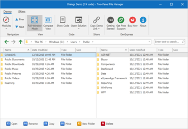
New File ManagerNew File Manager allows you to build a file/folder manager for both local storage and virtual folder hierarchies.
Features
Microsoft Visual Studio 2022 Support
- DevExpress installers now ship separate VSIX extensions for Visual Studio 2022 to ensure that all major design-time tools (like the "DevExpress" menu, DevExpress Template Gallery, Toolbox, etc.) are fully functional.
Microsoft .NET 6 Support
- Added support for the latest Preview build of .NET 6. In addition, the DevExpress Template Gallery includes templates for .NET 5 and .NET 6.
New HTML & CSS Templates (CTP)
- You can now define data-aware templates for DevExpress WinForms UI controls with HTML-CSS markup. This feature allows you to ditch traditional control customizations based on properties and CustomDraw events in favor of the unmatched flexibility of web-inspired markup.
- New HtmlContentControl - A brand-new control designed to render the template assigned to it. You can use it to create a variety of UI elements including buttons, toolbars, search panels, etc. Note that this control is designed to render tags and CSS attributes supported by the WinForms controls. You cannot use this component to create web browsers.
- New HtmlContentPopup - Much like the HtmlContentControl, this new component renders HTML-CSS templates and displays results as a pop-up menu.
- New ItemsView for the DevExpress WinForms Data Grid - ItemsView is a web template-compatible Data Grid View. This View does not have default data representation. Its appearance and record layout is driven by the template assigned to it.
- A collection of small samples has been created to help you explore the capabilities of this new feature and apply web-inspired customizations to the desktop controls.
New File Manager (CTP)
- The new WinForms FileExplorerAssistant component allows you to build a file/folder manager for both local storage and virtual folder hierarchies. This new component allows you to display three UI elements on a Form or UserControl:
- Main Client Region: Uses the DevExpress WinForms Data Grid.
- Side Navigation (tree view): Uses the DevExpress WinForms TreeList.
- Address Bar: Uses the DevExpress WinForms BreadcrumbEdit control.
- You can combine UI elements as needed. For example, you can display all three controls to emulate Microsoft Windows Explorer or display two grid-based panels side-by-side (alongside the Address Bar) to replicate 3rd-party file managers like FAR and Total Commander.
- UI controls (Grid, TreeList, and Breadcrumb editor) are now pre-customized via extensions - objects similar to WinForms Behaviors. Extensions specify the appearance/behavior of controls, and an API to implement communication between UI controls (for example, update the Grid control when a user selects a Tree List node).
- Enhanced the underlying architecture of the WinForms File Dialogs (Open, Save, Browse Folder).
Microsoft Windows 11 Support - Rounded Corners
- Updated the UI to better match the Windows 11 user experience. Your DevExpress-powered WinForms apps can now include rounded corners to match the look and feel of Windows 11.
- Enable the new 'WindowsFormsSettings.AllowRoundedWindowCorners' setting to apply rounded corners to DevExpress-powered forms, dialogs, flyouts, and panels. Note: This setting affects apps running on Windows 11. You cannot display rounded corners on Windows 10 or earlier versions of the Windows operating system.
Data Grid
- WinExplorer View - HTML Templates
- The WinForms Data Grid's WinExplorer View now supports HTML/CSS templates. Options include:
- The 'WinExplorerViewStyleOptions.HtmlTemplate' property is now available for each individual WinExplorer View Style (large icons, tiles, details, etc.). Use this property to apply a default HTML template for a style.
- The 'WinExplorerView.HtmlTemplates' property stores your templates. To dynamically apply HTML templates, handle the 'QueryItemTemplate' event.
- Tile View - HTML Templates
- You can now create web-inspired tiles and bind them to data fields as needed. To create a web-inspired tile, assign your HTML template to the 'TileView.TileHtmlTemplate' property.
- You can create multiple HTML templates and add them to the TileView.TileHtmlTemplates collection. Handle the CustomItemTemplate event to apply templates to tiles.
- Named Placeholders
- You can now use field names as placeholders for CardCaptionFormat and RecordHeaderFormat properties.
- In previous versions, you had to reference required fields by the index of corresponding grid columns:
- New 'Text Search' Mode for Search Boxes within Column Headers
- Search boxes within column headers now offer full text search support. In previous versions, search boxes used filter mode instead - values that did not match the search strings were hidden. To activate Text Search mode, set the 'OptionsFilter.InHeaderSearchMode' property to 'TextSearch'.
- Note: This option searches within visible data rows (collapsed and group rows are ignored), and does not work in server mode.
- Data Source Configuration Wizard for .NET 5 Designer
- The Data Source Configuration Wizard is now available for .NET 5. Wizard options for traditional data source types that require (yet to be implemented) Microsoft DataSet components are not functional, but you can now use this Wizard to connect your existing data-aware controls to the following data source types:
- ADO.NET DataSet.
- XPO.
- Microsoft Entity Framework.
- MongoDB.
- JSON.
- Microsoft Excel sheets.
- Unbound or XML data.
New Heat Map Control
- This release ships with a new WinForms Heatmap Control. Features include:
- Data Binding.
- Unbound Mode.
- Coloring Algorithms.
- Zoom and Scroll.
- Cell Highlighting.
- Tooltip Support.
- Titles.
- Cell Labels.
- Legend.
- Customizable axes.
- Hit-testing.
Charting
- Customizable Empty Points
- The DevExpress Chart Control can now process gaps (within a data source) as empty points (points with undefined values). The appearance of these gaps can now be customized with different style options (based on Series view type). You can fully customize the appearance of point markers, line, and area segments for empty points.
- You can also draw 'mock' points instead of gaps (based on values for neighboring Series points). Set the series view’s EmptyPointOptions.ProcessPoints property to 'Interpolate'.
- Fast (Swift) Point Series
- Added a new lightweight Swift Point Series to quickly render large data sets as a scatter (XY) plot.
Data Editors
- Text Editor - Advanced Mode Enhancements
- You can now specify a data source with suggestions for the Text Editor when using "Advanced" mode. This data source will be used by the Text Editor to display automatic suggestions as users enter text into the Text Editor.
- Added a MRU (most recently used) option. The WinForms Text Editor can now display previous values in its "Recently Used" list.
- API enhancements include:
- In Advanced mode, the Text Editor throws a handled exception when you try to access its MaskBox property. This exception warns you that the MaskBox property is not available in Advanced Mode.
- Added new methods to extract a specific character or a line from the text box, including 'GetCharFromPosition', 'GetFirstCharIndexFromLine', 'GetPositionFromCharIndex', and more.
- SvgImageBox - Virtual Keyboard Support
- Added new options to the WinForms SvgImageBox control so you can implement a custom virtual keyboard in your WinForms apps. These include:
- Pressed state and pressed appearance support.
- Ability to change text for text elements.
- QueryUniqueItemId - a new event that allows you to assign unique IDs to cloned elements (when an SVG file contains 'use' elements).
Gantt Control
- HTML Templates
- You can now use HTML-CSS templates to customize the appearance of the following Gantt-related UI elements:
- Tasks, Summaries, and Milestones.
- Regular and Summary Task Progress.
- Regular, Summary and Milestone Task Baselines.
- Text Labels.
- Interaction Tooltips.
- Split Tasks.
- To create a template, use the Visual Studio integrated HTML Template Editor. To invoke the Template Editor, click the ellipsis button next to the 'GanttControl.HtmlTemplates' property in the Visual Studio Properties window. Once your template is ready, handle the 'GanttControl.QueryItemTemplate' event to assign the template to the appropriate UI element.
Map Control
- Radial Visualization for Clusters
- The WinForms Map control now supports radial visualization for clusters. This new feature allows you to quickly view all vector items in a cluster without zoom.
- Use the 'MapControl.InteractiveClusterMode' property to enable this option. To expand a cluster on mouse hover, set this property to 'MouseHoverInteractiveClusterMode'.
- The following interfaces allows you to expand/collapse clusters:
- ExpandCluster.
- CollapseCluster.
- CollapseAllClusters.
- You can implement a custom algorithm to position elements as needed when expanding a cluster. To expand a cluster, create a class that implements the 'IExpandedClusterLayout' interface.
- Lambert Azimuthal Equal-Area Projection
- This release includes support for a new projection type – the European Terrestrial Reference System 1989 - Lambert azimuthal equal-area (ETRS89-LAEA) projection. You can use this projection to display European Union (EU) maps with minimal distortion.
- To enable this new projection, set the GeoMapCoordinateSystem.Projection property to Etrs89LambertAzimuthalEqualAreaProjection.
- Generate Polylines and Polygons from a Collection of Points
- The ListSourceDataAdapter can now generate polylines and polygons from a collection of coordinates in the data source.
- Added two new property mapping types for multi-point shapes (MapPolylines and MapPolygons):
- MapPolylinePointCollectionMapping.
- MapPolygonPointCollectionMapping.
Pivot Grid
- Accessibility and UI Automation Support
- Accessibility options include:
- Screen readers can now obtain information from field headers, field value items, cells, and filter panel.
- Added AccessibleName and AccessibleDescription properties to pivot fields.
- The DevExpress WinForms PivotGrid control also supports UI automation. You can now test the following UI elements:
- Pivot Grid: Grid and Table patterns.
- Cells: GridItem, TableItem, Value and Invoke (Select) patterns.
- Headers: Invoke (Select) pattern.
- Field Value Items: Value and Invoke (Expand/Collapse) patterns.
- Use the 'WindowsFormsSettings.UseUIAutomation' property to enable UI Automation.
Rich Text Editor
- PDF Export - Accessible PDF Support
- The WinForms Rich Text Editor can now generate tagged (accessible) PDF documents to address needs of those who use screen readers and other assistive technologies. The following standards are now supported:
- PDF/A-1a.
- PDF/A-2a.
- PDF/A-3a.
- PDF/UA.
- Custom Font Loading Engine
- The WinForms Rich Text Editor can now use fonts that are not installed on a target system. This feature avoids font substitution effects when you display, print, or export (to PDF) documents with non-standard fonts.
- You will be able to load necessary fonts from files, streams, or byte arrays. These fonts will be available to all instances of the DevExpress Rich Text Editor within a given project.
- Field Enhancements
- The DevExpress WinForms Rich Text Editor now supports SECTIONPAGES, REF, and STYLEREF fields. The following field-related enhancements are also included:
- You can now replace fields with field values.
- New UpdateAllFields method: Allows you to update all document fields (including fields located in headers, footers, text boxes, footnotes, and endnotes).
- You can now suppress DOCVARIABLE field updates for loaded documents.
- Watermark Enhancements
- Extended the Watermark API. You can now execute the following actions:
- Insert watermarks into individual section headers.
- Modify existing watermarks (change watermark options and replace watermark image or text).
- Remove watermarks from individual sections.
Scheduler
- HTML Templates
- The DevExpress WinForms Scheduler control supports the new HTML Template engine. Added the 'HtmlTemplates' property to all Scheduler Views. Use this property to assign HTML templates to appointments and all-day events.
- Stretch Appointments
- Appointment display settings for MonthView, TimelineView, GanttView and YearView now ship with a new setting - StretchAppointmentsMode. This setting allows you to control cell rendering behavior (when a cell contains too many appointments). It is available when the 'StretchAppointments' option is enabled. Available options include:
- GrowOnly (default value) - the Scheduler displays as many appointments as possible without clipping text, and hides remaining appointments under the 'More Appointments' button.
- GrowAndShrink - appointments are not limited by cell height. Cells can grow/shrink as needed.
- Appointment and Column Width
- You can now use the 'ColumnWidth' property to specify column width, or you can use the 'AppointmentWidth' property to specify appointment width:
- The 'ColumnWidth' property works when the 'StretchAppointments' property is set to "Fixed".
- The 'AppointmentWidth' property works when the 'StretchAppointments' property is set to "Auto".
- Both settings are available in Day, Work Week, and Full Week Views.
Skins and Vector Icons
- Skin Editor - UX Enhancements
- This release includes a number of UX-related enhancements:
- The "Find Element" dialog (Ctrl+F) now groups elements by categories. The search has been improved.
- It is now easier to locate required skin elements: all elements found under the mouse pointer (Ctrl+Click) now display both legacy and alias names. The Ctrl+Click shortcut behavior has been improved for XtraForms and Dialog Forms.
- The "Highlight Skin Elements" Ribbon command now highlights elements for both active and inactive states.
- An interactive quick start guide for new users has been created.
Spreadsheet
- PDF Export - Accessible PDF Support
- The WinForms and WPF Spreadsheet controls can now generate tagged (accessible) PDF documents to address needs of those who use screen readers and other assistive technologies. The following standards are now supported:
- PDF/A-1a.
- PDF/A-2a.
- PDF/A-3a.
- PDF/UA.
- Custom Font Loading Engine
- The Spreadsheet control can now use fonts that are not installed on a target system. This feature avoids font substitution effects when you display, print, or export (to PDF) documents with non-standard fonts. You will be able to load necessary fonts from files, streams, or byte arrays. These fonts will be available to all instances of the DevExpress Spreadsheet within a given project.
- Set Print Settings in Print Preview
- The 'Print Preview' window includes a new Settings pane. This pane allows you to specify the following print-related settings:
- Select spreadsheet content to print. You can print the entire workbook or print a portion of the document.
- Specify the number of copies to print.
- Customize page settings (document orientation, paper size, and page margins).
- Set print scaling.
- New CellEditorOpened Event
- A new CellEditorOpened event has been created. This event allows you to:
- Access the active in-cell editor.
- Handle the editor's keyboard events to execute custom actions or implement custom shortcuts.
- Spell check text in the editor.
- Handle the editor's TextChanged event to track text changes and validate user input.
- Custom Paper Size Support
- With this release, you can specify non-standard paper sizes when printing documents. Use the new 'Worksheet.ActiveView.SetCustomPaperSize' method to define custom paper size for a worksheet.
TreeList
- Advanced Customization Form
- Enhanced the TreeList's Customization Form and made column customization easier (especially useful if your TreeList includes multiple columns and bands). The new Customization Form displays all columns and bands (visible and hidden). Features include:
- Toggle Column and Band Visibility.
- Column/Band Search.
- Drag & Drop.
- Sorting.
- Activate the 'UseAdvancedCustomizationForm' option to incorporate the new TreeList Customization Form.
Vertical Grid
- Grid Title and Record Headers
- The WinForms Vertical and Property Grid controls can now display a caption/title. Use the grid's 'Caption' property to specify the caption, and enable the 'ShowCaption' option to display it on screen.
- The Vertical Grid control now supports record headers. These fully customizable headers (including HTML-formatted text strings, custom painted and click-able elements) allow you to display any custom data within two-dimensional data views.
- Compare Records Side-by-Side
- End-users can now compare individual records side-by-side, temporarily hiding other records. To compare individual records, simply right-click a record's header and select "Add to Comparison" (or select the record using the checkbox). When all required records are selected, invoke the context menu once again and select "Show Comparison".
- Added new API so you can compare records in code. These include:
- AddToComparison.
- RemoveFromComparison.
- ShowComparison.
- HideComparison.
- ClearComparison.
- IsInComparison.
- Row Smart Tags
- Added smart tag menus with common settings so you can quickly and easily customize the WinForms Vertical and Property Grid controls at design-time.
↧
November 2, 2021, 8:54 am
Blazor Rich Text Editor Comprehensive software development package for desktop, web and mobile app development.
Features
DevExpress has released a major update across their entire product range.
↧
November 2, 2021, 8:56 am
JavaScript Toolbar Customization APIIncludes new products and dozens of high-impact features for desktop, web and mobile app development.
Features
DevExpress has released a major update across their entire product range.
↧
↧
November 4, 2021, 3:38 am
MindFusion.WinForms PackImproves Diagramming and Spreadsheet controls.
Features
MindFusion.Diagramming
- Spatial index - Set the EnableSpatialIndex property of the Diagram to create an index of item positions for faster hit-testing and viewport clipping queries. This should greatly improve user interaction and rendering speed for diagrams containing tens of thousands, or more, items.
- Pattern router - New PatternRouter class, routes links by applying patterns of segment and turn sequences and accepting them when resulting paths do not cross nodes:
- A path is accepted if its final segment ends in a target point and is orthogonal to the respective side of the target node. If there are several possible paths, the router selects the shortest one.
- The MinimumDistance property specifies a minimum allowed distance of link segments from nodes.
- The PreferredDistance property specifies a distance of first or last link bend from the associated node.
- PatternRouter includes several predefined patterns designed to create consistent-looking paths, and allows the creation of custom patterns.
- Custom patterns can be defined as a sequence of RouteStep objects specifying whether the path advances by relative or absolute distance, or changes direction.
- Composite router - The CompositeRouter class lets you chain link routers (objects implementing ILinkRouter interface) so that a link passes through the sequence until it gets routed successfully.
- API changes
- Suspend and Resume methods have been removed from ILinkRouter. (Call Diagram's SuspendLinkRouter and ResumeLinkRouter methods instead.)
- Default Diagram.LinkRouter has been changed from QuickRouter to CompositeRouter instance.
- The bool SmartPolylineEnds property of RoutingOptions has been replaced by PolylineRouting enum property, which also provides an option to prevent inclined link segments for LinkShape.Polyline routes.
- CreateGdiPen method of Pen class now requires the target Graphics object as an argument.
MindFusion.Spreadsheet
- Extended the set of expression types in which blank cells are promoted to zeros or empty strings when referenced from formulas.
- Custom format strings can now contain color names in square brackets, compatible with Microsoft Excel color specifiers.
- Names of named ranges can now include backslash and question mark symbols.
↧
November 12, 2021, 3:30 am
Register for the .NET 6 Webinar today!Everything you need to know about .NET 6 and professional desktop application UI/UX.
ComponentOne Studio Enterprise is an extensive, flexible collection of performant, extensible .NET UI controls for mobile, web, and desktop. With the recent release of .NET 6, developers need to know how to take advantage of the revolutionary changes included in this version of the Microsoft Framework.
To help you get ready to hit the ground running with .NET 6, GrapeCity is hosting a live webinar on November 16, at 1:00 PM EST.
This webinar will highlight the benefits of .NET 6 compared to the .NET Framework and .NET 5. GrapeCity's Greg Lutz will take you through this new release step by step and also share the ComponentOne .NET 6 roadmap, demonstrate their popular desktop controls, and build a .NET 6 application in Microsoft Visual Studio 2022.
Topics include:
- Benefits of .NET 6
- ComponentOne UI controls for .NET developers
- .NET 6 release status for all platforms
- WinForms & WPF demonstrations using Visual Studio 2022
- .NET 6 Roadmap - what to expect from ComponentOne in v3 and 2022
Don't miss out! Register for this informative webinar now.
↧
November 12, 2021, 7:34 am
Telerik UI for BlazorAdds compatibility with Microsoft .NET 6.0.
Features
- Common
- Updated DPL version to 2021.3.1109.
- Added compatibility with Microsoft .NET 6.0.
↧
November 12, 2021, 9:05 am
Kendo UI + Telerik UI for JSPGrid adds support for multi-sort CTRL+Click behavior.
Features
- Common
- Added new PivotGridV2.
- Added support for Microsoft Visual Studio 2022.
- Updated Classic Theme Package (v4.42.0).
- Updated Bootstrap Theme Package (v4.42.0).
- Updated Default Theme Package (v4.42.0).
- Updated Material Theme Package (v4.42.0).
- ColorPicker
- Added RGB input, Gradient/Palette Views, Contrast Tool and Update rendering.
- Grid
- Added Fit All Columns Width to Content.
- Added multi-sort CTRL+Click behavior.
- Added support for Non-String Fields in Grid's Search Panel.
- PanelBar
- Updated PanelBar rendering and CSS classes.
- TreeList
- Added keyboard navigation to Treelist Pager.
↧
↧
November 12, 2021, 9:12 am
KendoReactImproves Editor, Dropdowns and Scheduler.
Features
- Chip
- Updated rendering and classes to match the latest design.
- Dropdowns
- Added popupClass prop to popupSettings.
- Editor
- Exposed interfaces for onMount, onExecute, onPaste, onFocus and onBlur event objects.
- Multiviewcalendar
- Added new classes to the rendering based on the design.
- Scheduler
- Added Auto Item Height functionality.
- Added Adaptive Slot Height functionality.
↧
November 12, 2021, 9:13 am
Telerik UI for WinFormsAdds Windows 11 rounded corner support along with support for Visual Studio 2022 and .NET 6.0.
Features
- Added rounded corner support in Microsoft Windows 11 - the behavior is enabled by default and can be controlled by the Telerik.WinControls.WindowsSettings.EnableRoundedCornersDefaultValue property.
- RadRichTextEditor Mentions (Suggestions) - enables you to show a predefined list of suggestions to be inserted into the document content when the users type a specific mention character, e.g. '@'.
- RadSchedulerNavigator Date Selector - selecting a date inside the calendar will change the start date of the active view preserving the same days count.
- RadPropertyGrid - added ability to specify a different height for each item.
- RadVirtualKeyboard - added beep sound functionality after pressing a key and improved API for finding key row without the necessary of knowing the exact keyboard layout.
- RadTaskBoard - polished the users and tags management in the task cards.
- Support and Compatibility
- Added full Microsoft Visual Studio 2022 and Microsoft .NET 6.0 support.
- RadForm
- Added global setting to apply rounded corners style for Windows 11.
- RadVirtualKeyboard
- Added beep sound functionality after pressing a key.
- WordsProcessing
- DocxFormatProvider: Added support for hyperlinks on images.
↧
November 12, 2021, 9:14 am
Telerik UI for ASP.NET MVCAdds support for Visual Studio 2022 and improves ColorPicker, PdfProcessing and TreeList.
Features
- Common
- Added support for Microsoft Visual Studio 2022.
- Updated Classic Theme Package (v4.42.0).
- Updated Bootstrap Theme Package (v4.42.0).
- Updated Default Theme Package (v4.42.0).
- Updated Material Theme Package (v4.42.0).
- ColorPicker
- Added RGB input, Gradient/Palette Views, Contrast Tool and Update rendering.
- Grid
- Added Fit All Columns Width to Content.
- PanelBar
- Updated PanelBar rendering and CSS classes.
- TreeList
- Added keyboard navigation to Treelist Pager.
- PdfProcessing
- Now handles importing documents containing entries with duplicated object number in more than one subsection.
- WordsProcessing
- DocxFormatProvider: Added support for hyperlinks on images.
↧
November 12, 2021, 9:15 am
Telerik UI for ASP.NET CoreAdds support for Microsoft .NET 6.0 and improves TreeList, PanelBar and Grid.
Features
- Common
- Added support for Microsoft Visual Studio 2022.
- Added support for Microsoft .NET 6.0.
- Updated Classic Theme Package (v4.42.0).
- Updated Bootstrap Theme Package (v4.42.0).
- Updated Default Theme Package (v4.42.0).
- Updated Material Theme Package (v4.42.0).
- ColorPicker
- Added RGB input, Gradient/Palette Views, Contrast Tool and Update rendering.
- Grid
- Added Fit All Columns Width to Content.
- PanelBar
- Updated PanelBar rendering and CSS classes.
- TreeList
- Added keyboard navigation to Treelist Pager.
- PdfProcessing
- Now handles importing documents containing entries with duplicated object number in more than one subsection.
- WordsProcessing
- DocxFormatProvider: Added support for hyperlinks on images.
↧
↧
November 12, 2021, 9:16 am
Telerik UI for WPFAdds support for Microsoft .NET 6.0 and improves Calendar, ComboBox and PdfProcessing.
Features
- Added support for Microsoft .NET 6.0.
- Common
- Added 'View All Properties' link into the Design Time Suggested Actions for all controls (support in Microsoft Visual Studio 2022 and above).
- Removed the design binaries from the WPF 4.0 and 4.5 folders in the NuGet packages.
- Buttons
- Unified styling of RadSplitButtons when IsBackgroundVisible is set to false or IsEnabled to False in their IsChecked state for Green, Office2016, Office2016Touch, VisualStudio2019, and Office2019 themes. Unified styling of RadRadioButton and RadSplitButton when the IsChecked state is true and IsDisabled is false to be the same as RadToggleButton for VisualStudio2019 and Office2019 themes.
- Calendar
- Updated weekly numbers in the RadCalendar to use FontWeight SemiBold in the Fluent theme.
- ColorEditor
- Added ColorSettingsPanelWidth property that controls the width of the color settings panel.
- ComboBox
- Added DropDownButtonIconContent and DropDownButtonIconTemplate properties to allow for easier customization of the drop-down icon.
- GanttView
- Added new AutoSizeTimeline property which allows users to set the timeline part to automatically take all the available space.
- GridView
- Improved support for ICustomTypeProvider objects when using nested properties and indexers, e.g. Player.Name, Clubs[0].Players[GK].Name. The ICustomTypeProvider interface is available in .NET 4.5 or higher.
- PdfProcessing
- Now handles importing documents containing entries with duplicated object number in more than one subsection.
- SpellChecker
- Exposed the LayoutTokenizer class. This class enables you to easily separate text into words so they can be later spellchecked. This could be useful if you need to implement spell checking for custom control.
- WordsProcessing
- DocxFormatProvider: Added support for hyperlinks on images.
↧
November 12, 2021, 9:17 am
Telerik UI for ASP.NET AJAXAdds support for Visual Studio 2022 along with updates to the Spreadsheet and Grid controls.
Features
- Common
- Added support for Microsoft Visual Studio 2022.
- Added support for Web Live Preview.
- Grid
- WAI-ARIA: Added the ability to assign custom aria-label to a Grid's numerical paging controls.
- PdfProcessing
- Now handles importing documents containing entries with duplicated object number in more than one subsection.
- Spreadsheet
- fromFile() now returns a Promise.
- WordsProcessing
- DocxFormatProvider: Added support for hyperlinks on images.
↧
November 12, 2021, 9:18 am
Kendo UIAdds support for non-string fields in Grid Search Panel.
Features
- Common
- Added new PivotGridV2.
- Added support for Microsoft Visual Studio 2022.
- Updated Classic Theme Package (v4.42.0).
- Updated Bootstrap Theme Package (v4.42.0).
- Updated Default Theme Package (v4.42.0).
- Updated Material Theme Package (v4.42.0).
- ColorPicker
- Added RGB input, Gradient/Palette Views, Contrast Tool and Update rendering.
- Grid
- Added Fit All Columns Width to Content.
- Added multi-sort CTRL+Click behavior.
- Added support for non-string fields in Search Panel.
- PanelBar
- Updated PanelBar rendering and CSS classes.
- TreeList
- Added keyboard navigation to Treelist Pager.
↧